US CUrrency redesign
Past future transit maps
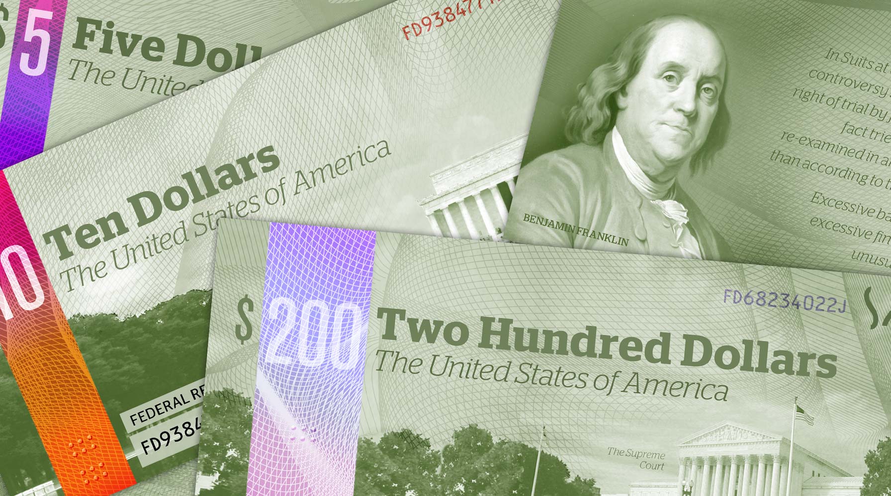
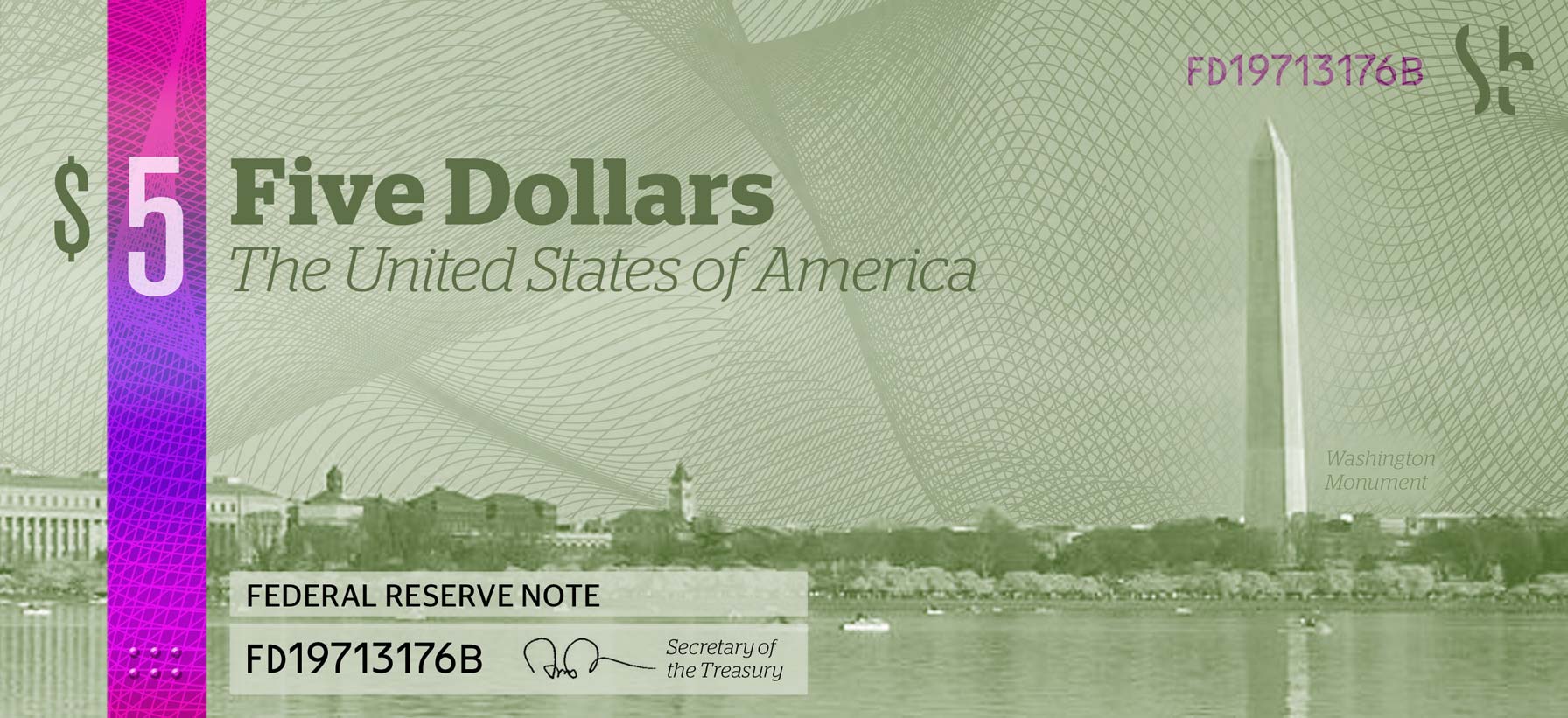
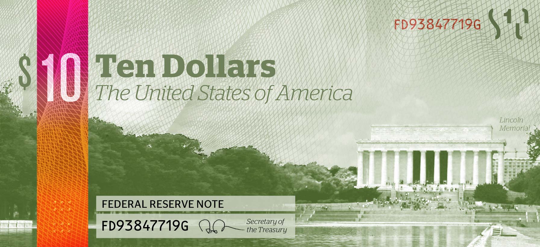
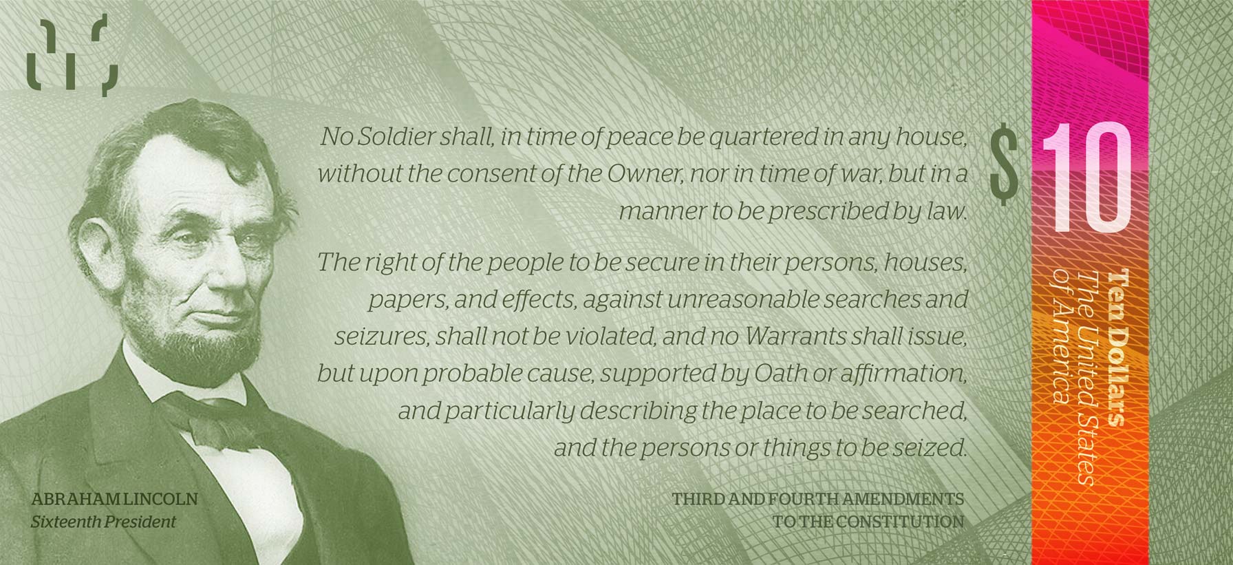
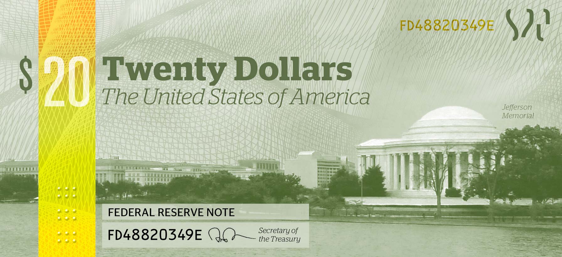
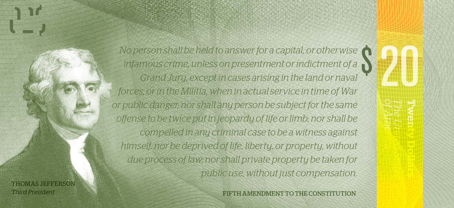
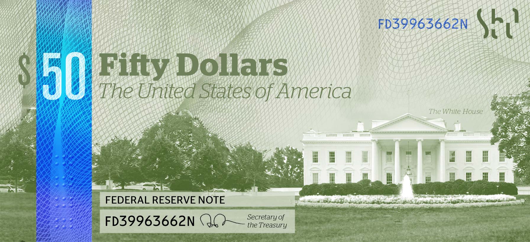
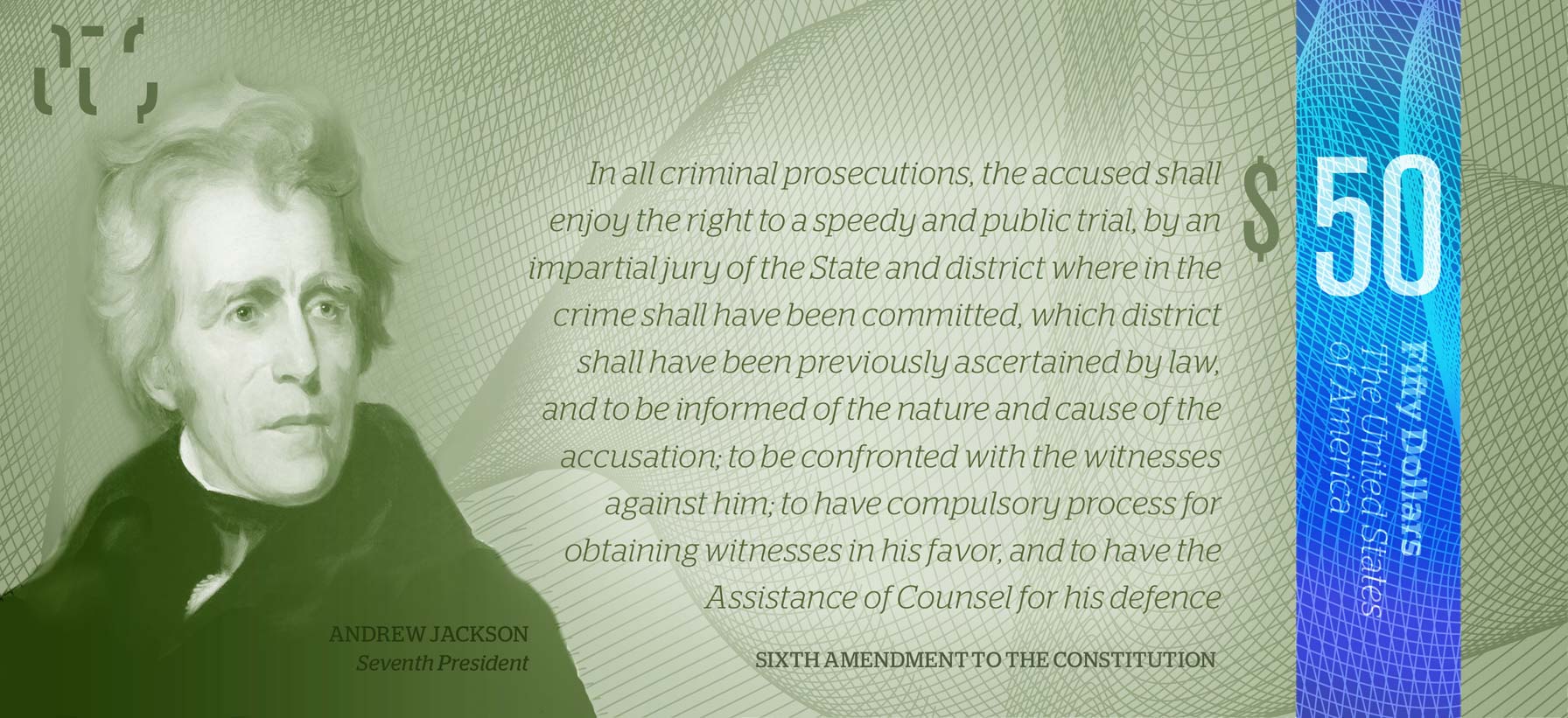
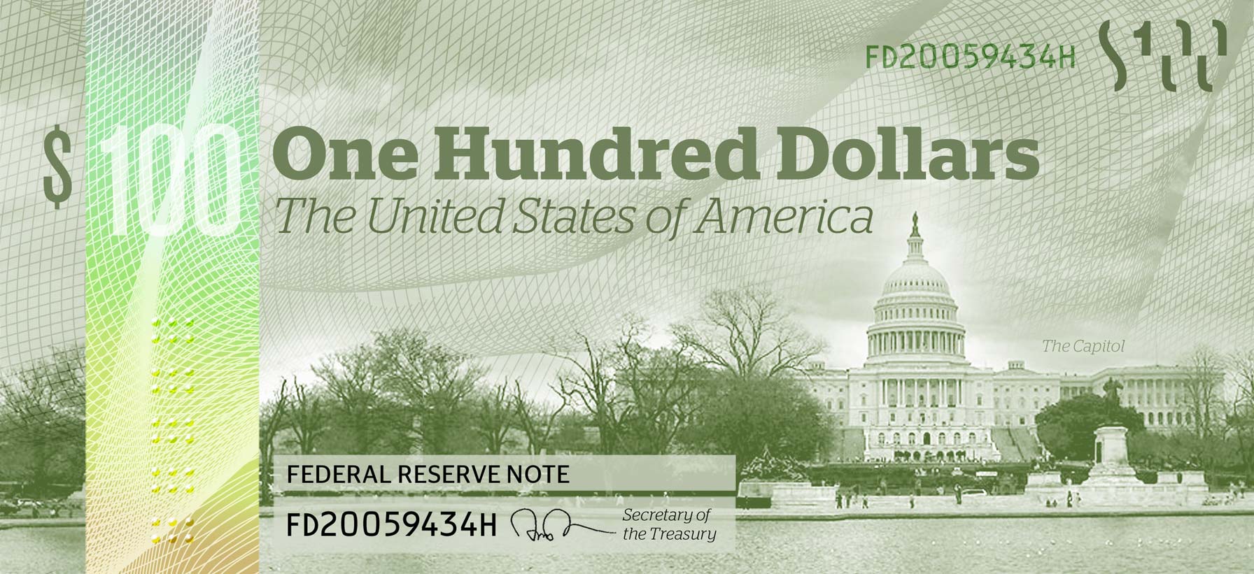
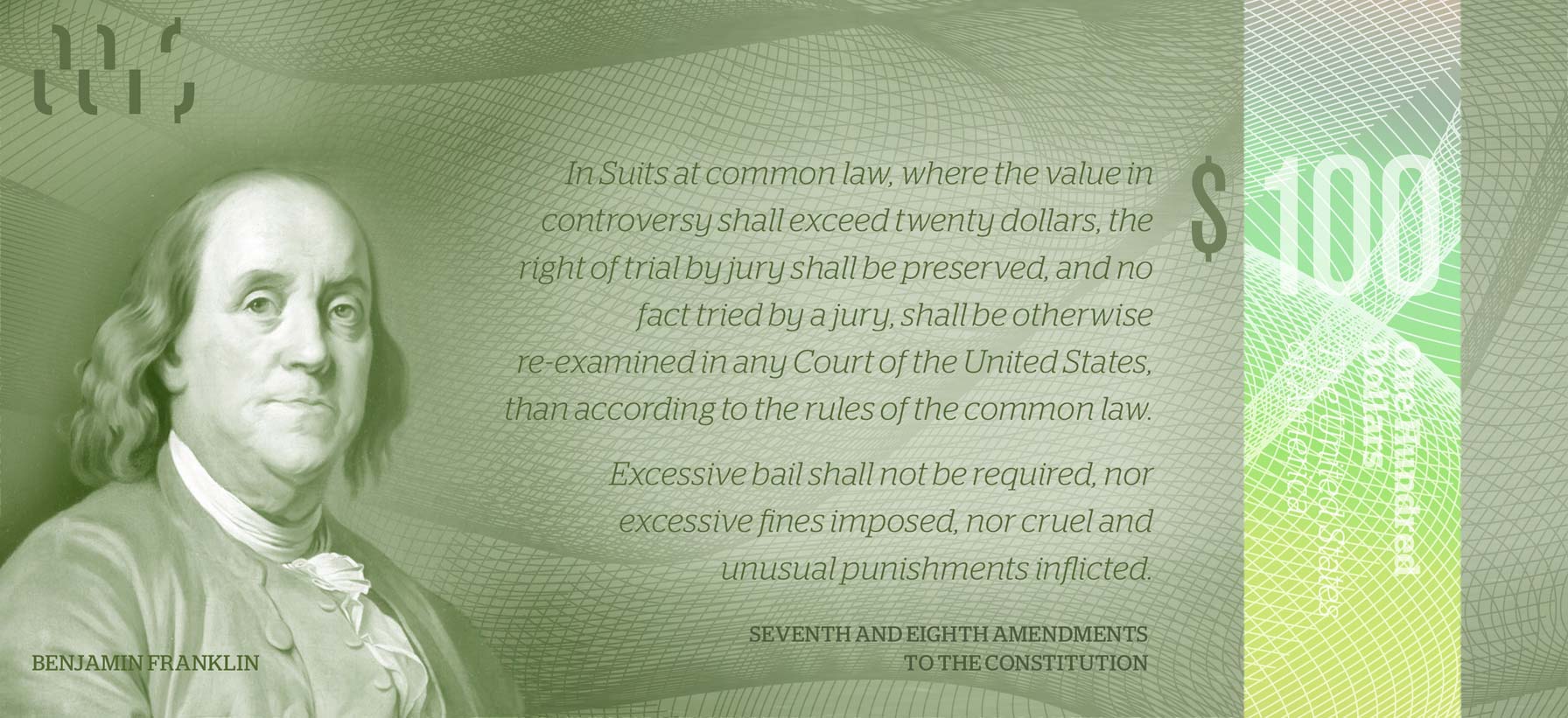
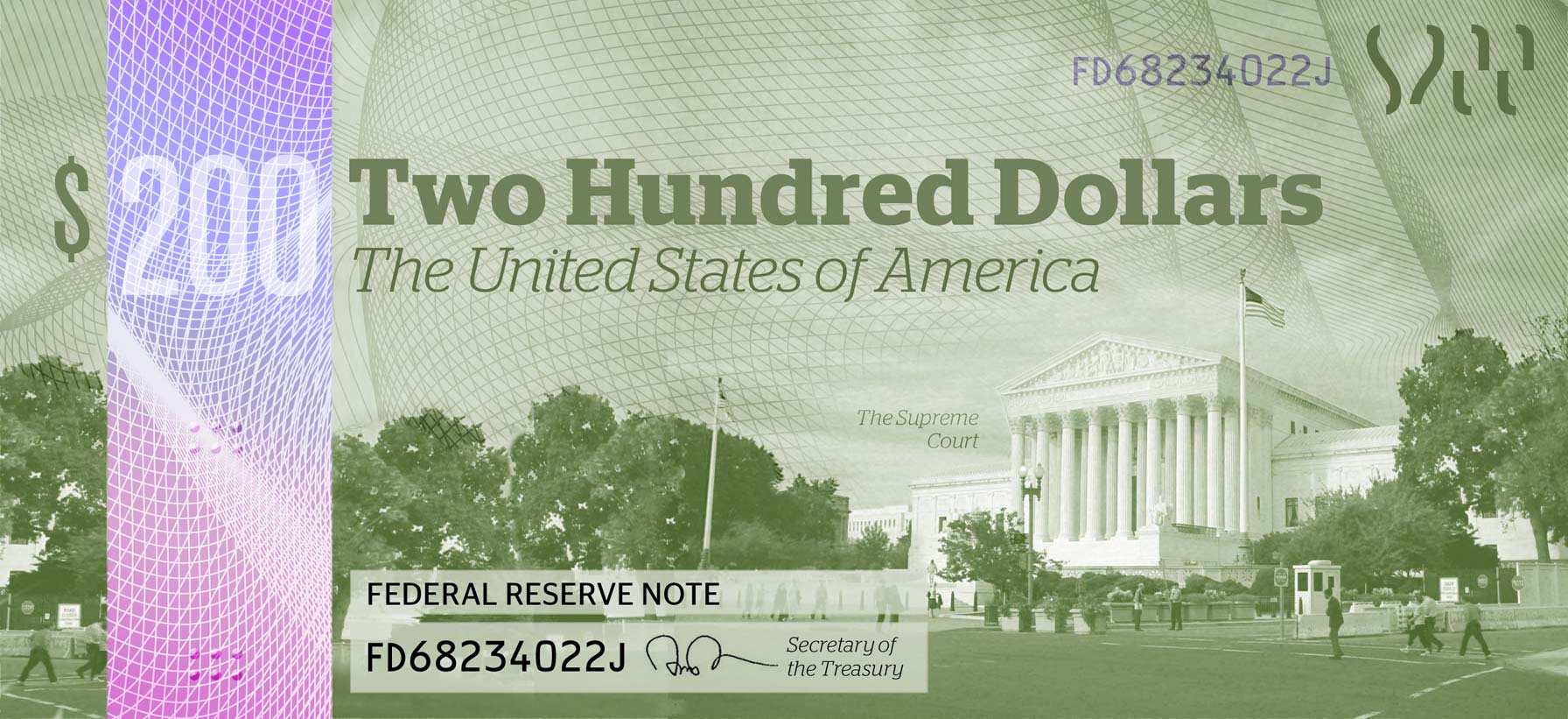
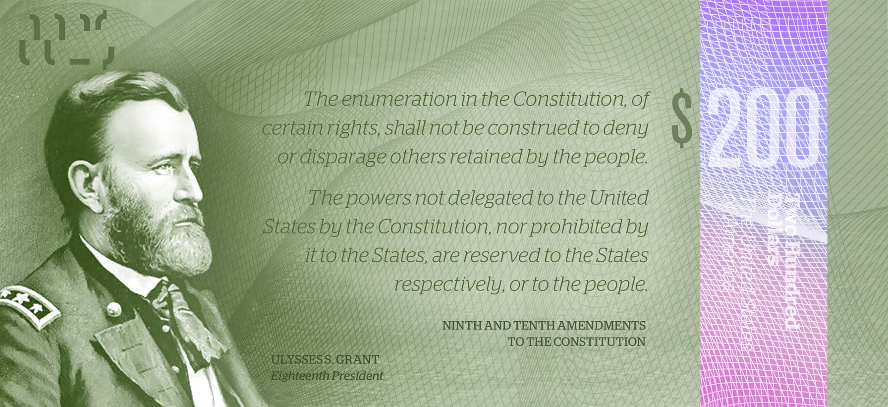
Entry to a US currency redesign competition. American banknotes are in dire need of a redesign. Even though the green color of money is deeply interwoven into the nation’s culture, the need for color differentiation between denominations has forced the inclusion of color. The recent redesign of banknotes by the Bureau of Engraving and Printing is poorly executed and aesthetically lacking. Because the coloring of the current notes is so subtle, it is still hard to differentiate between denominations by that method alone.
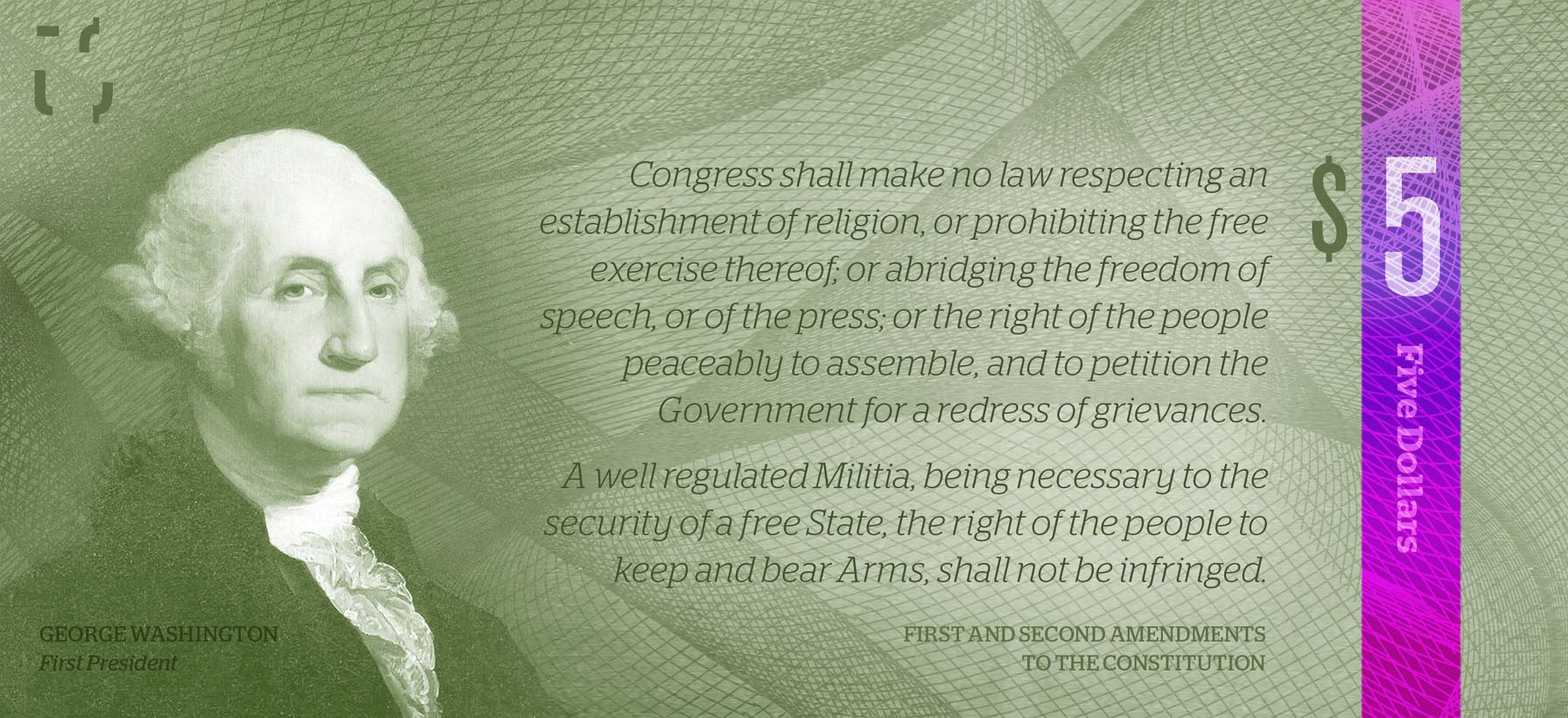
My proposed redesign keeps the culturally important green color of money, but introduces a brightly colored holographic strip into each denomination, making them easy to tell apart. This strip includes embossed dots for the sight-impaired as well, making currency far more accessible. The reverse of each note contains a portion of the Bill of Rights
Fun fact: this design became part of an internet hoax, with people saying it was the actual new design for U.S. currency. Which is how I got a Snopes page.
← Back to work | © 2024 Michael Tyznik